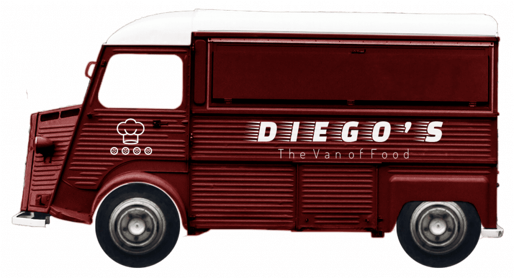
«Having to decide between food and music is a dilemma that puts the user at a crossroads and can hinder, even break a unique experience.
At Diego’s we couldn’t allow that.»
DURATION
January-June 2022
ROL
Co-Founder & UX Designer
RESPONSABILITIES
Concept Investigation
Wireframes & mockups Usability testing
Prototyping Accessibility
SCENARIO
Have you ever been in this situation?
THE CHALLENGE
Facilitate and streamline the food ordering and delivery process at events by allowing the user to squeeze every second out of every second through an ordering and pick-up management app.
All without forgetting the innovation, quality and proximity of a cuisine with international taste.
PERSONA
CAROLINA
TONI
37 Double degree Barcelona 1 child Senior consultor
19 Bachelor Madrid 1 fish Student in Biology
Carolina is a music lover who needs a fast, simple and secure ordering process because she hates missing any detail about the event.
Toni is a cuisine lover who needs a correct atmosphere and live cooking because he loves trying new things, asking and learning
USER JOURNEY
How do users interact with us?
COMPETITIVE AUDIT
The food truck sector has experienced strong growth and popularization in recent times. Despite this, digitalization is still a pending subject for many of these businesses. Nevertheless, it was decided to select a number of competitors (direct and indirect) to gain insight into this sector.
Although none of the following offer a similar value proposition to Diesgo’s, the following is a summary of certain essential aspects revealed by the study:
Competitors’ strengths: Know-how / Great quality / Fabulous truck / Different cuisines in one / Close brand image
Competitors’ weaknesses: No apps / Website problems / No target / Low range of mobility
Oportunities: Sanitary difficulties / No environment around the food truck
Gaps: Specializing in music and art events / Develop an unique app
SKETCHING
With the priority of creating an ATTRACTIVE and SIMPLE interface, it was proposed to create 5 «Home pages» of different styles to maximize creativity and imagination (sometimes the craziest ideas are the ones that provide the difference). From the first sketches, we wanted to focus on the essential information to make the user’s flow more dynamic and agile. The variety of styles and components was a key factor in the later stages of the design.
* Stars were used to mark the elements of each sketch that would be used in the following designs.
LO-FI WIREFRAMES
MOCKUPS
RE-THINKING
USABILITY STUDY
Logo not easily readable
Flow with unnecessary steps (forward & backward)
Sense of doubt and insecurity when making payment
Lack of consistency and color homogeneity
The «BLOG» button is confusing
Check contrast and change font color
Include at the top the categories in each of the categories
Add additional information about the operation by means of a POP-UP
Follow color patterns (e.g. «product» and «add to the cart» components)
Add written support under the icon
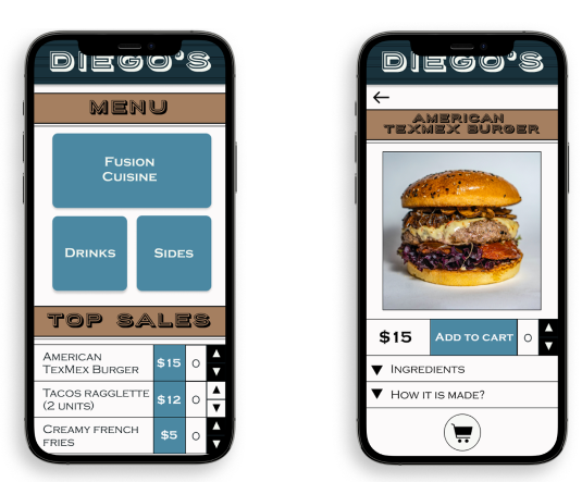
APP & FEATURES
LEARNINGS & REFLECTIONS
«For the first time developing a product from scratch to this very page has been a FASCINATING experience. Discovering the surface of the UX Design world has meant a change in me.
In addition, I’ve learned to use versatile and useful tools like Figma or Material Design, highly creative techniques like Crazy Eights, the importance of research and to perform usability studies, above all, to value their relevance to improve your work.»